This is a little bit off topic from what I have blogged about recently. But I recently had an opportunity to work with CSS sprites.
This is a copy of the blog post that I originally posted here:
Using CSS Sprites to Improve Web Page Loading
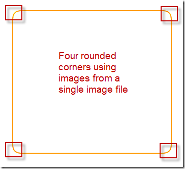
I was developing a new web page for an intranet web application. The web designer recommended that the key blocks of content be wrapped in boxes with distinct border colors and rounded corners. The image below shows the key parts of that recommendation. The boxes had to be able to resize dynamically based on the amount of content and the size of the web browser. Below is an image of one of the squares with rounded corners.
The original web page contained separate images for each border and corner image. That resulted in 43 images for the page as it appears above:
- 20 corner images
- 20 border images
- 1 image for the exclamation mark
- 2 images for the arrows
The download time for the web page was very high during performance load testing. So I made changes to use CSS sprites. First, I replaced the 20 border images with border calls that appeared in the CSS as below.
{background-color:#FFFFFF; border:2px solid #FF9900;}
Then I merged all of the images together into one image using the CSS Sprite Generator site at http://csssprites.com/index.html. Below is a sample image of four corner images merged into one image file.
As a result, I went from 43 http requests to only one. That was a huge improvement; but now I had to figure out how to use one image file as the source for all of the remaining images. I added the CSS rounded corners for each of the blocks. This was the tricky part because the images still had to be able to position themselves dynamically.
.roundedBox {position:relative; padding:17px; margin:10px 0;}
.corner {position:absolute; width:20px; height:20px; no-repeat;}
I then defined which image to use in which corner for each of the “squares”. Below is the CSS for one of the squares. Note that background-position is used to define the starting point of the image that I want to use in each corner.
.topLeft {top:0; left:0; background-position:-0px -294px;}
.topRight {top:0; right:0; background-position:-0px -315px;}
.bottomLeft {bottom:0; left:0; background-position:-0px -252px;}
.bottomRight {bottom:0; right:0; background-position:-0px -273px;}
Next, I defined the square using the CSS. Note the reference to the sprites.gif image. The CSS for each square refers to the same image file. I also define the border size and border color in the first line of the CSS.
#roundedsquare {background-color:#FFFFFF; border:2px solid #FF9900;}
#roundedsquare .corner {background-image:url(./images/sprites.gif);}
#roundedsquare .topLeft {top:-2px; left:-2px;}
#roundedsquare .topRight {top:-2px; right:-2px;}
#roundedsquare .bottomLeft {bottom:-2px; left:-2px;}
#roundedsquare .bottomRight {bottom:-2px; right:-2px;white-space:nowrap;}
I add the div tags to the web page. I essentially wrap the html around with the div tags. The class statements reference the CSS styles that I created.
<div class="roundedBox" id="roundedsquare">
<— add html here —><div id="cornertd" style="display:block">
<div class="corner topLeft"></div>
<div class="corner topRight"></div>
<div class="corner bottomLeft"></div>
<div class="corner bottomRight"></div>
</div>
</div>
The result is that the html is surrounded by a square with rounded corners. The images used for the rounded corners line up with the borders. The images and borders also use the same color and background.
I found it to be very simple after applying CSS sprites the first time. I did have to sometimes adjust the positioning of the images within the sprite image. That is, I learned to give them more space so as not to overlap when set on the web page.

